You sometimes want to deploy your Next JS under /blog, /docs, or /dashboard folder. But by default, you can only deploy your Next JS on your project root folder.
Since Next JS 9.5, you can change this configuration by setting basePath in your next.config.js. By default, basePath is set to / but you can modify to /blog or /docs:
1
module.exports = { basePath: '/docs',};
That also means you can also run several Next JS applications under the same domain. You don’t need to create a subdomain anymore.
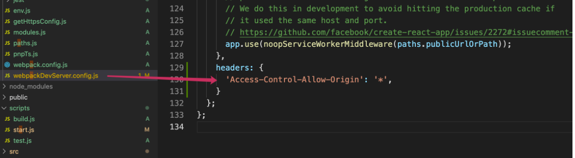
After updating basePath, you won’t be able to visit http://localhost:3000 on your local development environment. To continue to browse on your local machine, you need to add basePath value after http://localhost:3000.
For your information, you don’t need to update your links in your Next JS code. Indeed, it’ll automatically prepend basePath value to all your links.
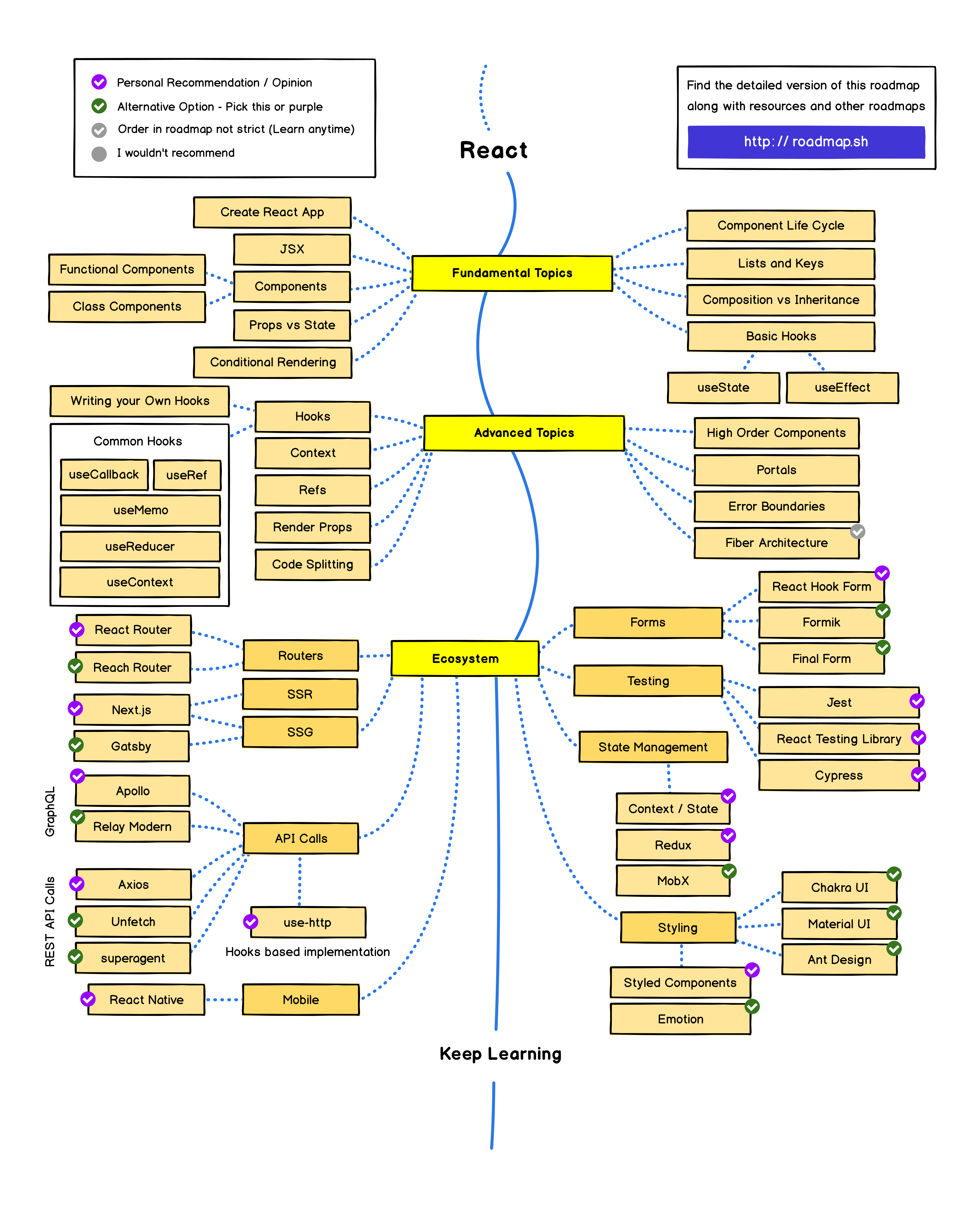
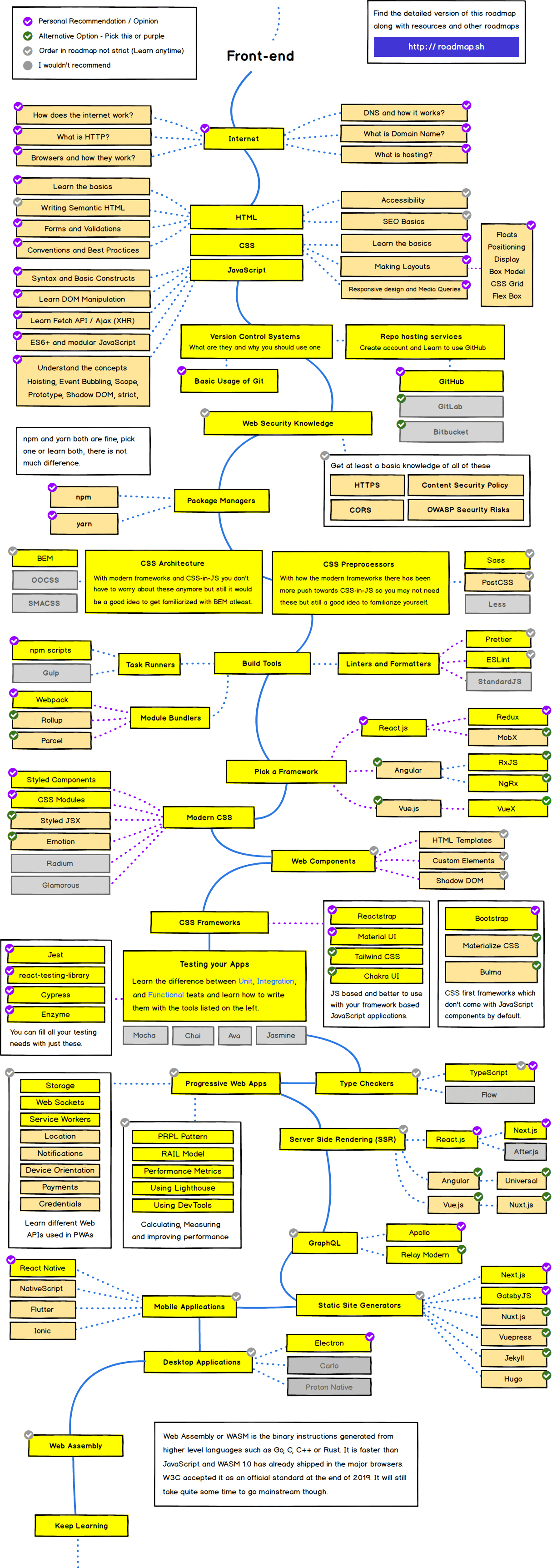
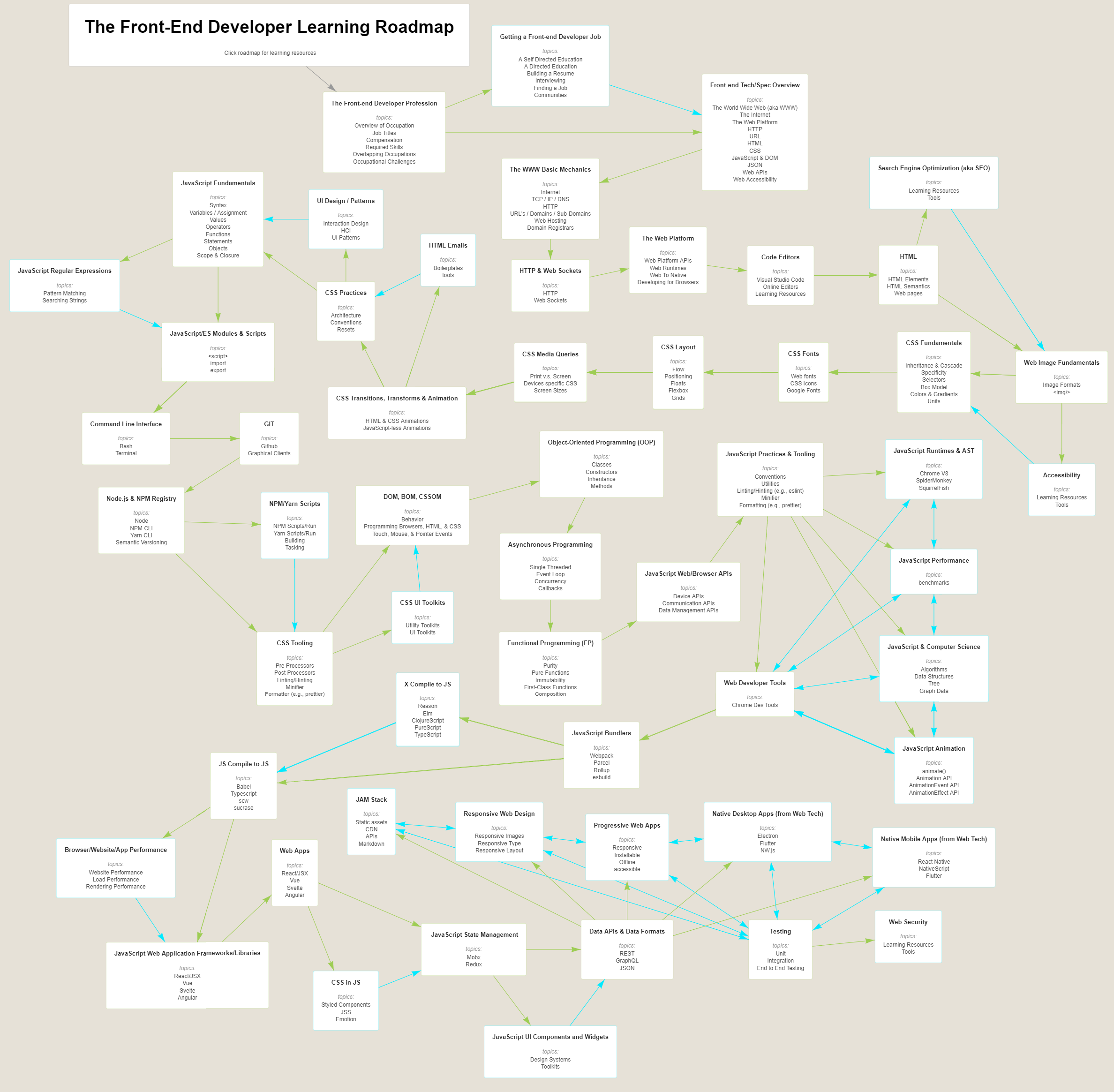
Everything that is there to learn about React and the ecosystem in 2021. https://roadmap.sh/react
The list below is exhaustive, and the items are listed in no particular order. You don’t need to learn everything listed in the picture, however knowing what you don’t know is as important as knowing things.
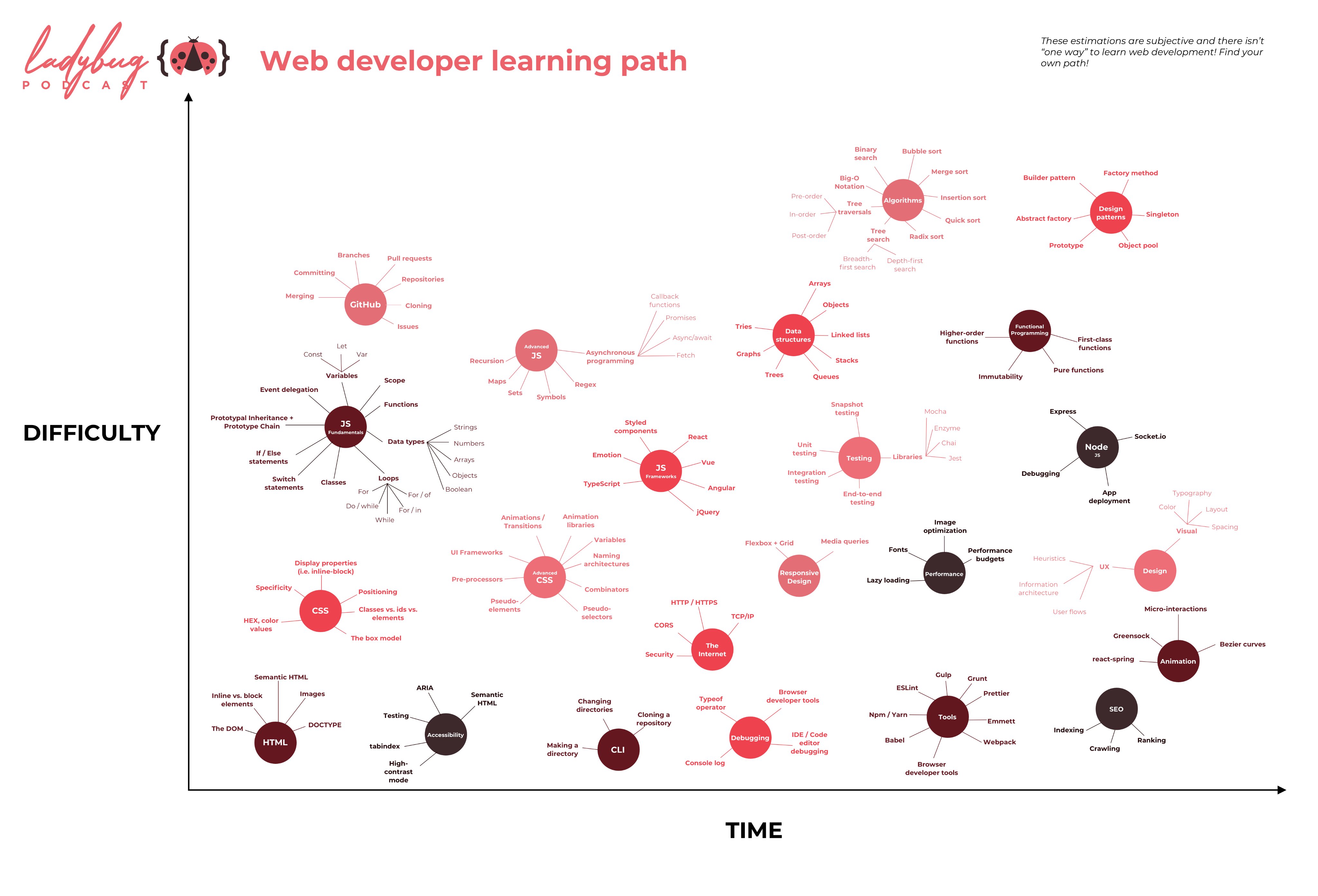
This is all subjective (different skills are more difficult for some people than for other) and there isn’t “one way” to learn web development! These are just some of the skills you might want to learn! https://www.ladybug.dev/episodes/web-developer-learning-path
Throttling and debouncing techniques has been in use for past many years in javascript. In this post I’d like to share my knowledge on how we can use throttle and debounce functions with help of react hooks.
Consider below example with two routes / and /count rendering respective components.
Suppose in practical applications you need to use throttle and wait for every 100ms before we execute increaseCount. I have used the lodash throttle function for this example.
Wait, no need to hurry. It will work if you are at /count route. The increaseCount function will be throttled and will increase the count after 100ms of intervals.
But as you move to the / route to render the Home component and unmount the Count component, and start scrolling on home page, you will notice a warning in console which warns about memory leak. This is probably because the scroll event was not cleaned properly. The reason is _.throttle(increaseCount, 100) is called again during unmount and returns another function which does not match that created during the mount stage. What if we create a variable and store the throttled instance.
But it has problem too. The throttledCount is created on every render, which is not at all required. This function should be initiated once which is possible inside the useEffect hook. As it will now be computed only once during mount.
Above example is pretty simple. Let’s look at another example where there is an input field and you need to increment the count only after user stops typing for certain time. And there is text which is updated on every keystroke which re renders the component on every input.
This will not work. The count will increase for every keystroke. The reason behind is that on every render, a new debouncedCount is created. We have to store this debounced function such that it is initiated only once like that in useEffect in above example. Here comes use of useCallback. useCallback will return a memoized version of the callback that only changes if one of the dependencies has changed - React docs Replace
One should always keep in mind that every render call of react functional component will lead to expiration of local variables and re-initiation unless you memoize them using hooks.
UmiJS is an extensible, enterprise-level React framework authored by Alipay’s developer team. Alipay uses it in its internal projects, as do several other companies such as Youku and Netease.
While exploring this framework, I discovered that it’s similar to Next.js in a handful of interesting ways. Both have support for routing and server-side rendering out of the box as well as TypeScript.
Along the way, I got curious about Umi and decided to look deeper into the framework to see how it compares with Next. I evaluated both frameworks based on the criteria listed below. Here are my findings.
CSS support
Next has support for all CSS styling methods including CSS in JS, Sass, Stylus, Less, CSS module and Post CSS. You can just import the css file into your pages in case of regular CSS:
1 2 3 4 5 6 7 8 9 10 11 12 13 14 15 16
// styles.css body { font-family: 'SF Pro Text', 'SF Pro Icons', 'Helvetica Neue', 'Helvetica', 'Arial', sans-serif; padding: 20px 20px 60px; max-width: 680px; margin: 0 auto; }
// pages/_app.js import '../styles.css'
// This default export is required in a new `pages/_app.js` file. export default function MyApp({ Component, pageProps }) { return <Component {...pageProps} /> }
Next has official plugins for writing CSS using Sass, Stylus, and Less. If you’re using CSS modules, you’ll need to follow Next’s naming convention, [name].module.css.
// Button.module.css /* You do not need to worry about .error {} colliding with any other `.css` or `.module.css` files! */ .error { color: white; background-color: red; }
// Button.js import styles from './Button.module.css'
export function Button() { return ( <button type="button" // Note how the "error" class is accessed as a property on the imported // `styles` object. className={styles.error} > Destroy </button> ) }
Umi, on the other hand, has dropped support for Sass and currently supports regular CSS, CSS module, and Less. If you want to use Sass or Stylus, you’ll need to configure the webpack config to do so. Umi automatically recognizes the use of CSS modules.
1 2 3 4 5
// Example of CSS Modules import styles from'./foo.css';
// Example of Non-CSS Modules import'./foo.css';
webpack customization
Next features such as code splitting, hot code reloading, and server-side rendering already work out of the box. But if you need extra power or just a different configuration, Next allows you to write your own configuration through its next.config.js module. The config file is a regular Node.js module instead of a JSON file.
I found Next’s documentation to be more detailed in explaining how to use each feature.
To show how each feature works, the docs walk you through building a simple blog app.
Another thing to consider: part of Umi’s documentation is not yet translated into English (Umi’s main user base is located in China). I had to use Google Translate feature to help me read the documentation.
CLI support
Umi has some interesting CLI support to generate pages and check the current webpack configuration.
1 2 3 4 5 6 7 8 9 10 11 12 13 14 15 16 17
Usage: umi <command> [options]
Commands:
build build application for production config umi config cli dev start a dev server for development generate generate code snippets quickly help show command helps plugin inspect umi plugins version show umi version webpack inspect webpack configurations dva test test with jest
Run `umi help <command>` for more information of specific commands. Visit https://umijs.org/ to learn more about Umi.
Next’s CLI support is focused solely on helping you to deploy the application.
1 2 3 4 5 6 7 8 9 10 11 12
Usage $ next <command>
Available commands build, start, export, dev, telemetry
Options --version, -v Version number --help, -h Displays this message
For more information run a command with the --help flag $ next build --help
Plugin system
Umi’s internal functions are all third-party plugins. The documentation covers how its plugin system works, complete with a test framework.
Next has its own set of plugins, but I can’t seem to find instructions on how to create one and share it with other developers.
Why Next has the edge
Both Next and Umi fully support building React applications for production with little to no configuration. Next has more complete support for writing CSS and customizing its webpack configuration, while Umi is more opinionated and doesn’t give much support for webpack configurations.
For now, I prefer Next to Umi because I find the Umi documentation a bit hard to understand. I also found more guides for building things with Next, such as e-commerce websites and static sites.
// If you want to start measuring performance in your app, pass a function // to log results (for example: reportWebVitals(console.log)) // or send to an analytics endpoint。Learn more: https://bit.ly/CRA-vitals reportWebVitals();
The goal of this tutorial is to guide you through setting up and deploying your first Gatsby site. Along the way, you’ll learn some general web development topics as well as the fundamentals of building a Gatsby site.
Note: This tutorial is intended to be as accessible as possible to people without much web development experience. If you prefer to jump straight to code, feel free to skip to the quick start.
Set Up Your Development Environment
Before you start building your first Gatsby site, you’ll need to familiarize yourself with some core web technologies and make sure that you have installed all required software tools.
Familiarize yourself with the command line
The command line is a text-based interface used to run commands on your computer. You’ll also often see it referred to as the terminal. In this tutorial, we’ll use both interchangeably. It’s a lot like using the Finder on a Mac or Explorer on Windows. Finder and Explorer are examples of graphical user interfaces (GUI). The command line is a powerful, text-based way to interact with your computer.
Note: If you’re new to the command line, “running” a command, means “writing a given set of instructions in your command prompt, and hitting the Enter key”. Commands will be shown in a highlighted box, something like node --version, but not every highlighted box is a command! If something is a command it will be mentioned as something you have to run/execute.
Install Node.js for your appropriate operating system
Node.js is an environment that can run JavaScript code outside of a web browser. Gatsby is built with Node.js. To get up and running with Gatsby, you’ll need to have a recent version installed on your computer. npm comes bundled with Node.js so if you don’t have npm, chances are that you don’t have Node.js either.
Mac instructions
To install Gatsby and Node.js on a Mac, it is recommended to use Homebrew. A little set-up in the beginning can save you from some headaches later on!
How to install or verify Homebrew on your computer:
Open your Terminal.
See if Homebrew is installed. You should see “Homebrew” and a version number.
Once you’ve installed Homebrew, repeat step 2 to verify.
Install Xcode Command Line Tools:
Open your Terminal.
Install Xcode Command line tools by running:
1 2
xcode-select --install
💡 If that fails, download it directly from Apple’s site, after signing-in with an Apple developer account.
After being prompted to start the installation, you’ll be prompted again to accept a software license for the tools to download.
Install Node
Open your Terminal
Install node with Homebrew:
1 2
brew install node
💡 If you don’t want to install it through Homebrew, download the latest Node.js version from the official Node.js website, double click on the downloaded file and go through the installation process.
When nvm is installed, it does not default to a particular node version. You’ll need to install the version you want and give nvm instructions to use it. This example uses the version 10 release, but more recent version numbers can be used instead.
1 2 3
nvm install 10 nvm use 10
Confirm that this worked:
1 2 3
npm --version node --version
The output should look similar to the screenshot below, showing version numbers in response to the commands.
Once you have followed the installation steps and you have checked everything is installed properly, you can continue to the next step.
Install Git
Git is a free and open source distributed version control system designed to handle everything from small to very large projects with speed and efficiency. When you install a Gatsby “starter” site, Gatsby uses Git behind the scenes to download and install the required files for your starter. You will need to have Git installed to set up your first Gatsby site.
The steps to download and install Git depend on your operating system. Follow the guide for your system:
The Gatsby CLI tool lets you quickly create new Gatsby-powered sites and run commands for developing Gatsby sites. It is a published npm package.
The Gatsby CLI is available via npm and should be installed globally by running:
1 2
npm install -g gatsby-cli
Note: when you install Gatsby and run it for the first time, you’ll see a short message notifying you about anonymous usage data that is being collected for Gatsby commands, you can read more about how that data is pulled out and used in the telemetry doc.
Now you are ready to use the Gatsby CLI tool to create your first Gatsby site. Using the tool, you can download “starters” (partially built sites with some default configuration) to help you get moving faster on creating a certain type of site. The “Hello World” starter you’ll be using here is a starter with the bare essentials needed for a Gatsby site.
Open up your terminal.
Create a new site from a starter:
1 2
gatsby new hello-world https://github.com/gatsbyjs/gatsby-starter-hello-world
💡 What happened?
new is a gatsby command to create a new Gatsby project.
Here, hello-world is an arbitrary title — you could pick anything. The CLI tool will place the code for your new site in a new folder called “hello-world”.
Lastly, the GitHub URL specified points to a code repository that holds the starter code you want to use.
💡 Depending on your download speed, the amount of time this takes will vary. For brevity’s sake, the gif below was paused during part of the install
Change into the working directory:
1 2
cd hello-world
💡 This says ‘I want to change directories (cd) to the “hello-world” subfolder’. Whenever you want to run any commands for your site, you need to be in the context for that site (aka, your terminal needs to be pointed at the directory where your site code lives).
Start the development mode:
1 2
gatsby develop
💡 This command starts a development server. You will be able to see and interact with your new site in a development environment — local (on your computer, not published to the internet).
View your site locally
Open up a new tab in your browser and navigate to http://localhost:8000/
Congrats! This is the beginning of your very first Gatsby site! 🎉
You’ll be able to visit the site locally at http://localhost:8000/ for as long as your development server is running. That’s the process you started by running the gatsby develop command. To stop running that process (or to “stop running the development server”), go back to your terminal window, hold down the “control” key, and then hit “c” (ctrl-c). To start it again, run gatsby develop again!
Note: If you are using VM setup like vagrant and/or would like to listen on your local IP address, run gatsby develop --host=0.0.0.0. Now, the development server listens on both http://localhost and your local IP.
Set up a code editor
A code editor is a program designed specifically for editing computer code. There are many great ones out there.
Download VS Code
Gatsby documentation sometimes includes screenshots that were taken in VS Code, so if you don’t have a preferred code editor yet, using VS Code will make sure that your screen looks like the screenshots in the tutorial and docs. If you choose to use VS Code, visit the VS Code site and download the version appropriate for your platform.
Install the Prettier plugin
We also recommend using Prettier, a tool that helps format your code to avoid errors.
Open the extensions view on VS Code (View => Extensions).
Search for “Prettier - Code formatter”.
Click “Install”. (After installation, you’ll be prompted to restart VS Code to enable the extension. Newer versions of VS Code will automatically enable the extension after download.)
It’s not necessary to be an expert with these already — if you’re not, don’t worry! You’ll pick up a lot through the course of this tutorial series. These are some of the main web technologies you’ll use when building a Gatsby site:
HTML: A markup language that every web browser is able to understand. It stands for HyperText Markup Language. HTML gives your web content a universal informational structure, defining things like headings, paragraphs, and more.
CSS: A presentational language used to style the appearance of your web content (fonts, colors, layout, etc). It stands for Cascading Style Sheets.
JavaScript: A programming language that helps us make the web dynamic and interactive.
React: A code library (built with JavaScript) for building user interfaces. It’s the framework that Gatsby uses to build pages and structure content.
GraphQL: A query language that allows you to pull data into your website. It’s the interface that Gatsby uses for managing site data.
What is a website?
For a comprehensive introduction to what a website is — including an intro to HTML and CSS — check out “Building your first web page”. It’s a great place to start learning about the web. For a more hands-on introduction to HTML, CSS, and JavaScript, check out the tutorials from Codecademy. React and GraphQL also have their own introductory tutorials.
Learn more about the command line
For a great introduction to using the command line, check out Codecademy’s Command Line tutorial for Mac and Linux users, and this tutorial for Windows users. Even if you are a Windows user, the first page of the Codecademy tutorial is a valuable read. It explains what the command line is, not how to interface with it.
Learn more about npm
npm is a JavaScript package manager. A package is a module of code that you can choose to include in your projects. If you downloaded and installed Node.js, npm was installed with it!
npm has three distinct components: the npm website, the npm registry, and the npm command line interface (CLI).
On the npm website, you can browse what JavaScript packages are available in the npm registry.
The npm registry is a large database of information about JavaScript packages available on npm.
Once you’ve identified a package you want, you can use the npm CLI to install it in your project or globally (like other CLI tools). The npm CLI is what talks to the registry — you generally only interact with the npm website or the npm CLI.
You will not need to know Git to complete this tutorial, but it is a very useful tool. If you are interested in learning more about version control, Git, and GitHub, check out GitHub’s Git Handbook.
Get to Know Gatsby Building Blocks
In the previous section, you prepared your local development environment by installing the necessary software and creating your first Gatsby site using the “hello world” starter. Now, take a deeper dive into the code generated by that starter.
Using Gatsby starters
In tutorial part zero, you created a new site based on the “hello world” starter using the following command:
1 2
gatsby new hello-world https://github.com/gatsbyjs/gatsby-starter-hello-world
When creating a new Gatsby site, you can use the following command structure to create a new site based on any existing Gatsby starter:
1 2
gatsby new [SITE_DIRECTORY_NAME] [URL_OF_STARTER_GITHUB_REPO]
If you omit a URL from the end, Gatsby will automatically generate a site for you based on the default starter. For this section of the tutorial, stick with the “Hello World” site you already created in tutorial part zero. You can learn more about modifying starters in the docs.
✋ Open up the code
In your code editor, open up the code generated for your “Hello World” site and take a look at the different directories and files contained in the ‘hello-world’ directory. It should look something like this:
Note: Again, the editor shown here is Visual Studio Code. If you’re using a different editor, it will look a little different.
Let’s take a look at the code that powers the homepage.
💡 If you stopped your development server after running gatsby develop in the previous section, start it up again now — time to make some changes to the hello-world site!
Familiarizing with Gatsby pages
Open up the /src directory in your code editor. Inside is a single directory: /pages.
Open the file at src/pages/index.js. The code in this file creates a component that contains a single div and some text — appropriately, “Hello world!”
✋ Make changes to the “Hello World” homepage
Change the “Hello World!” text to “Hello Gatsby!” and save the file. If your windows are side-by-side, you can see that your code and content changes are reflected almost instantly in the browser after you save the file.
💡 Gatsby uses hot reloading to speed up your development process. Essentially, when you’re running a Gatsby development server, the Gatsby site files are being “watched” in the background — any time you save a file, your changes will be immediately reflected in the browser. You don’t need to hard refresh the page or restart the development server — your changes just appear.
Now you can make your changes a little more visible. Try replacing the code in src/pages/index.js with the code below and save again. You’ll see changes to the text — the text color will be purple and the font size will be larger.
src/pages/index.js
1 2 3 4 5 6
Copysrc/pages/index.js: copy code to clipboard importReactfrom"react"
If you’re familiar with React and JSX, feel free to skip this section. If you haven’t worked with the React framework before, you may be wondering what HTML is doing in a JavaScript function. Or why we’re importing react on the first line but seemingly not using it anywhere. This hybrid “HTML-in-JS” is actually a syntax extension of JavaScript, for React, called JSX. You can follow along with this tutorial without prior experience with React, but if you’re curious, here’s a brief primer…
Consider the original contents of the src/pages/index.js file:
src/pages/index.js
1 2 3 4 5 6
Copysrc/pages/index.js: copy code to clipboard importReactfrom"react"
Now you can spot the use of the 'react' import! But wait. You’re writing JSX, not pure HTML and JavaScript. How does the browser read that? The short answer: It doesn’t. Gatsby sites come with tooling already set up to convert your source code into something that browsers can interpret.
Building with components
The homepage you were just making edits to was created by defining a page component. What exactly is a “component”?
Broadly defined, a component is a building block for your site; It is a self-contained piece of code that describes a section of UI (user interface).
Gatsby is built on React. When we talk about using and defining components, we are really talking about React components — self-contained pieces of code (usually written with JSX) that can accept input and return React elements describing a section of UI.
One of the big mental shifts you make when starting to build with components (if you are already a developer) is that now your CSS, HTML, and JavaScript are tightly coupled and often living even within the same file.
While a seemingly simple change, this has profound implications for how you think about building websites.
Take the example of creating a custom button. In the past, you would create a CSS class (perhaps .primary-button) with your custom styles and then use it whenever you want to apply those styles. For example:
1 2
<buttonclass="primary-button">Click me</button>
In the world of components, you instead create a PrimaryButton component with your button styles and use it throughout your site like:
1 2
<PrimaryButton>Click me</PrimaryButton>
Components become the base building blocks of your site. Instead of being limited to the building blocks the browser provides, e.g. <button />, you can easily create new building blocks that elegantly meet the needs of your projects.
✋ Using page components
Any React component defined in src/pages/*.js will automatically become a page. Let’s see this in action.
You already have a src/pages/index.js file that came with the “Hello World” starter. Let’s create an about page.
Create a new file at src/pages/about.js, copy the following code into the new file, and save.
src/pages/about.js
1 2 3 4 5 6 7 8 9 10 11
Copysrc/pages/about.js: copy code to clipboard importReactfrom"react"
Just by putting a React component in the src/pages/about.js file, you now have a page accessible at /about.
✋ Using sub-components
Let’s say the homepage and the about page both got quite large and you were rewriting a lot of things. You can use sub-components to break the UI into reusable pieces. Both of your pages have <h1> headers — create a component that will describe a Header.
Create a new directory at src/components and a file within that directory called header.js.
Add the following code to the new src/components/header.js file.
src/components/header.js
1 2 3 4 5 6
Copysrc/components/header.js: copy code to clipboard importReactfrom"react"
exportdefaultfunctionHeader() { return<h1>This is a header.</h1> }
Modify the about.js file to import the Header component. Replace the h1 markup with <Header />:
src/pages/about.js
1 2 3 4 5 6 7 8 9 10 11 12
Copysrc/pages/about.js: copy code to clipboard importReactfrom"react" importHeaderfrom"../components/header"
In the browser, the “About Gatsby” header text should now be replaced with “This is a header.” But you don’t want the “About” page to say “This is a header.” You want it to say, “About Gatsby”.
Head back to src/components/header.js and make the following change:
src/components/header.js
1 2 3 4 5 6
Copysrc/components/header.js: copy code to clipboard importReactfrom"react"
You should now see your “About Gatsby” header text again!
What are “props”?
Earlier, you defined React components as reusable pieces of code describing a UI. To make these reusable pieces dynamic you need to be able to supply them with different data. You do that with input called “props”. Props are (appropriately enough) properties supplied to React components.
In about.js you passed a headerText prop with the value of "About Gatsby" to the imported Header sub-component:
src/pages/about.js
1 2
Copysrc/pages/about.js: copy code to clipboard <Header headerText="About Gatsby" />
Over in header.js, the header component expects to receive the headerText prop (because you’ve written it to expect that). So you can access it like so:
src/components/header.js
1 2
Copysrc/components/header.js: copy code to clipboard <h1>{props.headerText}</h1>
💡 In JSX, you can embed any JavaScript expression by wrapping it with {}. This is how you can access the headerText property (or “prop!”) from the “props” object.
If you had passed another prop to your <Header /> component, like so…
…you would have been able to also access the arbitraryPhrase prop: {props.arbitraryPhrase}.
To emphasize how this makes your components reusable, add an extra <Header /> component to the about page, add the following code to the src/pages/about.js file, and save.
src/pages/about.js
1 2 3 4 5 6 7 8 9 10 11 12 13
Copysrc/pages/about.js: copy code to clipboard importReactfrom"react" importHeaderfrom"../components/header"
And there you have it; A second header — without rewriting any code — by passing different data using props.
Using layout components
Layout components are for sections of a site that you want to share across multiple pages. For example, Gatsby sites will commonly have a layout component with a shared header and footer. Other common things to add to layouts include a sidebar and/or a navigation menu.
You’ll often want to link between pages — Let’s look at routing in a Gatsby site.
✋ Using the <Link /> component
Open the index page component (src/pages/index.js), import the <Link /> component from Gatsby, add a <Link /> component above the header, and give it a to property with the value of "/contact/" for the pathname:
src/pages/index.js
1 2 3 4 5 6 7 8 9 10 11 12 13 14 15
Copysrc/pages/index.js: copy code to clipboard importReactfrom"react" import { Link } from"gatsby" importHeaderfrom"../components/header"
When you click the new “Contact” link on the homepage, you should see…
…the Gatsby development 404 page. Why? Because you’re attempting to link to a page that doesn’t exist yet.
Now you’ll have to create a page component for your new “Contact” page at src/pages/contact.js and have it link back to the homepage:
src/pages/contact.js
1 2 3 4 5 6 7 8 9 10 11 12 13 14
Copysrc/pages/contact.js: copy code to clipboard importReactfrom"react" import { Link } from"gatsby" importHeaderfrom"../components/header"
exportdefaultfunctionContact() { return ( <divstyle={{color: `teal` }}> <Linkto="/">Home</Link> <HeaderheaderText="Contact" /> <p>Send us a message!</p> </div> ) }
After you save the file, you should see the contact page and be able to follow the link to the homepage.
The Gatsby <Link /> component is for linking between pages within your site. For external links to pages not handled by your Gatsby site, use the regular HTML <a> tag.
Deploying a Gatsby site
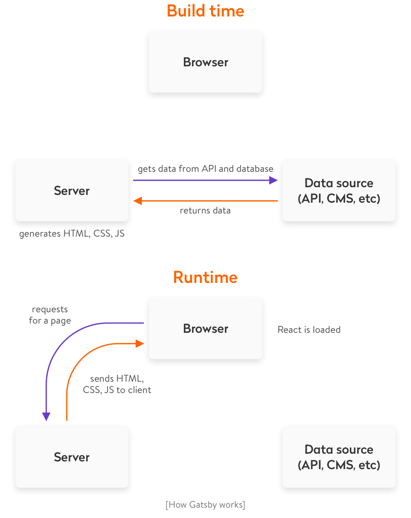
Gatsby is a modern site generator, which means there are no servers to set up or complicated databases to deploy. Instead, the Gatsby build command produces a directory of static HTML and JavaScript files which you can deploy to a static site hosting service.
Try using Surge for deploying your first Gatsby website. Surge is one of many “static site hosts” which makes it possible to deploy Gatsby sites.
Gatsby Cloud is another deployment option, built by the team behind Gatsby. In the next section, you’ll find instructions for deploying to Gatsby Cloud.
If you haven’t previously installed & set up Surge, open a new terminal window and install their command-line tool:
1 2 3 4 5
npm install --global surge # Then create a (free) account with them surge login
Next, build your site by running the following command in the terminal at the root of your site (tip: make sure you’re running this command at the root of your site, in this case in the hello-world folder, which you can do by opening a new tab in the same window you used to run gatsby develop):
1 2
gatsby build
The build should take 15-30 seconds. Once the build is finished, it’s interesting to take a look at the files that the gatsby build command just prepared to deploy.
Take a look at a list of the generated files by typing in the following terminal command into the root of your site, which will let you look at the public directory:
1 2
ls public
Then finally deploy your site by publishing the generated files to surge.sh. For newly-created surge account, you need to verify your email with surge before publishing your site (check your inbox first and verify your email).
1 2
surge public/
Note that you will have to press the enter key after you see the domain: some-name.surge.sh information on your command-line interface.
Once this finishes running, you should see in your terminal something like:
Open the web address listed on the bottom line (lowly-pain.surge.sh in this case) and you’ll see your newly published site! Great work!
Alternative: Deploying to Gatsby Cloud
Gatsby Cloud is a platform built specifically for Gatsby sites, with features like real-time previews, fast builds, and integrations with dozens of other tools. It’s the best place to build and deploy sites built with Gatsby, and you can use Gatsby Cloud free for personal projects.
To deploy your site to Gatsby Cloud, create an account on GitHub if you don’t have one. GitHub allows you to host and collaborate on code projects using Git for version control.
Create a new repository on GitHub. Since you’re importing your existing project, you’ll want a completely empty one, so don’t initialize it with README or .gitignore files.
You can tell Git where the remote (i.e. not on your computer) repository is like this:
1 2
git remote add origin [GITHUB_REPOSITORY_URL]
When you created a new Gatsby project with a starter, it automatically made an initial git commit, or a set of changes. Now, you can push your changes to the new remote location:
1 2
git push -u origin master
Now you’re ready to link this GitHub repository right to Gatsby Cloud! Check out the reference guide on Deploying to Gatsby Cloud.
➡️ What’s Next?
In this section you:
Learned about Gatsby starters, and how to use them to create new projects
Learned about JSX syntax
Learned about components
Learned about Gatsby page components and sub-components
Learned about React “props” and reusing React components
In this part, you’re going to explore options for styling Gatsby websites and dive deeper into using React components for building sites.
Using global styles
Every site has some sort of global style. This includes things like the site’s typography and background colors. These styles set the overall feel of the site — much like the color and texture of a wall sets the overall feel of a room.
Creating global styles with standard CSS files
One of the most straightforward ways to add global styles to a site is using a global .css stylesheet.
✋ Create a new Gatsby site
Start by creating a new Gatsby site. It may be best (especially if you’re new to the command line) to close the terminal windows you used for part one and start a new terminal session for part two.
Open a new terminal window, create a new “hello world” Gatsby site in a directory called tutorial-part-two, and then move to this new directory:
1 2 3
gatsby new tutorial-part-two https://github.com/gatsbyjs/gatsby-starter-hello-world cd tutorial-part-two
You now have a new Gatsby site (based on the Gatsby “hello world” starter) with the following structure:
💡 What is gatsby-browser.js? Don’t worry about this too much and for now, just know that gatsby-browser.js is one of a handful of special files that Gatsby looks for and uses (if they exist). Here, the naming of the file is important. If you do want to explore more now, check out the docs.
Import your recently-created stylesheet in the gatsby-browser.js file:
gatsby-browser.js
1 2 3 4 5
Copygatsby-browser.js: copy code to clipboard import"./src/styles/global.css"
// or: // require('./src/styles/global.css')
Note: Both CommonJS (require) and ES Module (import) syntax work here. If you’re not sure which to choose, import is usually a good default. When working with files that are only run in a Node.js environment however (like gatsby-node.js), require will need to be used.
Start the development server:
1 2
gatsby develop
If you take a look at your project in the browser, you should see a lavender background applied to the “hello world” starter:
Tip: This part of the tutorial has focused on the quickest and most straightforward way to get started styling a Gatsby site — importing standard CSS files directly, using gatsby-browser.js. In most cases, the best way to add global styles is with a shared layout component. Check out the docs for more on that approach.
Using component-scoped CSS
So far, we’ve talked about the more traditional approach of using standard CSS stylesheets. Now, we’ll talk about various methods of modularizing CSS to tackle styling in a component-oriented way.
A CSS Module is a CSS file in which all class names and animation names are scoped locally by default.
CSS Modules are very popular because they let you write CSS normally but with a lot more safety. The tool automatically generates unique class and animation names, so you don’t have to worry about selector name collisions.
Gatsby works out of the box with CSS Modules. This approach is highly recommended for those new to building with Gatsby (and React in general).
✋ Build a new page using CSS Modules
In this section, you’ll create a new page component and style that page component using a CSS Module.
First, create a new Container component.
Create a new directory at src/components and then, in this new directory, create a file named container.js and paste the following:
src/components/container.js
1 2 3 4 5 6 7
Copysrc/components/container.js: copy code to clipboard importReactfrom"react" import containerStyles from"./container.module.css"
exportdefaultfunctionContainer({ children }) { return<divclassName={containerStyles.container}>{children}</div> }
You’ll notice you imported a CSS module file named container.module.css. Let’s create that file now.
In the same directory (src/components), create a container.module.css file and copy/paste the following:
You’ll notice that the file name ends with .module.css instead of the usual .css. This is how you tell Gatsby that this CSS file should be processed as a CSS module rather than plain CSS.
Create a new page component by creating a file at src/pages/about-css-modules.js:
src/pages/about-css-modules.js
1 2 3 4 5 6 7 8 9 10 11 12 13
Copysrc/pages/about-css-modules.js: copy code to clipboard importReactfrom"react"
Now, if you visit http://localhost:8000/about-css-modules/, your page should look something like this:
✋ Style a component using CSS Modules
In this section, you’ll create a list of people with names, avatars, and short Latin biographies. You’ll create a <User /> component and style that component using a CSS module.
Create the file for the CSS at src/pages/about-css-modules.module.css.
Import the new src/pages/about-css-modules.module.css file into the about-css-modules.js page you created earlier by editing the first few lines of the file like so:
src/pages/about-css-modules.js
1 2 3 4 5 6
Copysrc/pages/about-css-modules.js: copy code to clipboard importReactfrom"react" import styles from"./about-css-modules.module.css" importContainerfrom"../components/container"
console.log(styles)
The console.log(styles) code will log the resulting import so you can see the result of your processed ./about-css-modules.module.css file. If you open the developer console (using e.g. Firefox or Chrome’s developer tools, often by the F12 key) in your browser, you’ll see:
If you compare that to your CSS file, you’ll see that each class is now a key in the imported object pointing to a long string e.g. avatar points to src-pages----about-css-modules-module---avatar---2lRF7. These are the class names CSS Modules generates. They’re guaranteed to be unique across your site. And because you have to import them to use the classes, there’s never any question about where some CSS is being used.
Create a new <User /> component inline in the about-css-modules.js page component. Modify about-css-modules.js so it looks like the following:
exportdefaultfunctionAbout() { return ( <Container> <h1>About CSS Modules</h1> <p>CSS Modules are cool</p> <User username="Jane Doe" avatar="https://s3.amazonaws.com/uifaces/faces/twitter/adellecharles/128.jpg" excerpt="I'm Jane Doe. Lorem ipsum dolor sit amet, consectetur adipisicing elit." /> <User username="Bob Smith" avatar="https://s3.amazonaws.com/uifaces/faces/twitter/vladarbatov/128.jpg" excerpt="I'm Bob Smith, a vertically aligned type of guy. Lorem ipsum dolor sit amet, consectetur adipisicing elit." /> </Container> ) }
Tip: Generally, if you use a component in multiple places on a site, it should be in its own module file in the components directory. But, if it’s used only in one file, create it inline.
There are many different CSS-in-JS libraries and many of them have Gatsby plugins already. We won’t cover an example of CSS-in-JS in this initial tutorial, but we encourage you to explore what the ecosystem has to offer. There are mini-tutorials for two libraries, in particular, Emotion and Styled Components.
Now continue on to part three of the tutorial, where you’ll learn about Gatsby plugins and layout components.
Creating Nested Layout Components
Welcome to part three!
What’s in this tutorial?
In this part, you’ll learn about Gatsby plugins and creating “layout” components.
Gatsby plugins are JavaScript packages that help add functionality to a Gatsby site. Gatsby is designed to be extensible, which means plugins are able to extend and modify just about everything Gatsby does.
Layout components are for sections of your site that you want to share across multiple pages. For example, sites will commonly have a layout component with a shared header and footer. Other common things to add to layouts are a sidebar and/or navigation menu. On this page for example, the header at the top is part of gatsbyjs.com’s layout component.
Let’s dive into part three.
Using plugins
You’re probably familiar with the idea of plugins. Many software systems support adding custom plugins to add new functionality or even modify the core workings of the software. Gatsby plugins work the same way.
Community members (like you!) can contribute plugins (small amounts of JavaScript code) that others can then use when building Gatsby sites.
There are already hundreds of plugins! Explore the Gatsby Plugin Library.
Our goal with plugins is to make them straightforward to install and use. You will likely be using plugins in almost every Gatsby site you build. While working through the rest of the tutorial you’ll have many opportunities to practice installing and using plugins.
For an initial introduction to using plugins, we’ll install and implement the Gatsby plugin for Typography.js.
Typography.js is a JavaScript library which generates global base styles for your site’s typography. The library has a corresponding Gatsby plugin to streamline using it in a Gatsby site.
✋ Create a new Gatsby site
As we mentioned in part two, at this point it’s probably a good idea to close the terminal window(s) and project files from previous parts of the tutorial, to keep things clean on your desktop. Then open a new terminal window and run the following commands to create a new Gatsby site in a directory called tutorial-part-three and then move to this new directory:
1 2 3
gatsby new tutorial-part-three https://github.com/gatsbyjs/gatsby-starter-hello-world cd tutorial-part-three
✋ Install and configure gatsby-plugin-typography
There are two main steps to using a plugin: Installing and configuring.
Note: Typography.js requires a few additional packages, so those are included in the instructions. Additional requirements like this will be listed in the “install” instructions of each plugin.
Edit the file gatsby-config.js at the root of your project to the following:
Typography.js needs a configuration file. Create a new directory called utils in the src directory. Then add a new file called typography.js to utils and copy the following into the file:
src/utils/typography.js
1 2 3 4 5 6 7 8
Copysrc/utils/typography.js: copy code to clipboard importTypographyfrom"typography" import fairyGateTheme from"typography-theme-fairy-gates"
Once you load the site, if you inspect the generated HTML using the Chrome developer tools, you’ll see that the typography plugin added a <style> element to the <head> element with its generated CSS:
✋ Make some content and style changes
Copy the following into your src/pages/index.js so you can see the effect of the CSS generated by Typography.js better.
src/pages/index.js
1 2 3 4 5 6 7 8 9 10 11 12 13 14
Copysrc/pages/index.js: copy code to clipboard importReactfrom"react"
exportdefaultfunctionHome() { return ( <div> <h1>Hi! I'm building a fake Gatsby site as part of a tutorial!</h1> <p> What do I like to do? Lots of course but definitely enjoy building websites. </p> </div> ) }
Your site should now look like this:
Let’s make a quick improvement. Many sites have a single column of text centered in the middle of the page. To create this, add the following styles to the <div> in src/pages/index.js.
src/pages/index.js
1 2 3 4 5 6 7 8 9 10 11 12 13 14
Copysrc/pages/index.js: copy code to clipboard importReactfrom"react"
exportdefaultfunctionHome() { return ( <divstyle={{margin: `3remauto`, maxWidth:600 }}> <h1>Hi! I'm building a fake Gatsby site as part of a tutorial!</h1> <p> What do I like to do? Lots of course but definitely enjoy building websites. </p> </div> ) }
Sweet. You’ve installed and configured your very first Gatsby plugin!
Creating layout components
Now let’s move on to learning about layout components. To get ready for this part, add a couple new pages to your project: an about page and a contact page.
src/pages/about.js
1 2 3 4 5 6 7 8 9 10 11 12 13
Copysrc/pages/about.js: copy code to clipboard importReactfrom"react"
exportdefaultfunctionAbout() { return ( <div> <h1>About me</h1> <p> I’m good enough, I’m smart enough, and gosh darn it, people like me! </p> </div> ) }
src/pages/contact.js
1 2 3 4 5 6 7 8 9 10 11 12 13
Copysrc/pages/contact.js: copy code to clipboard importReactfrom"react"
exportdefaultfunctionContact() { return ( <div> <h1>I'd love to talk! Email me at the address below</h1> <p> <ahref="mailto:me@example.com">me@example.com</a> </p> </div> ) }
Let’s see what the new about page looks like:
Hmm. It would be nice if the content of the two new pages were centered like the index page. And it would be nice to have some sort of global navigation so it’s easy for visitors to find and visit each of the sub-pages.
You’ll tackle these changes by creating your first layout component.
✋ Create your first layout component
Create a new directory at src/components.
Create a very basic layout component at src/components/layout.js:
src/components/layout.js
1 2 3 4 5 6 7 8 9 10
Copysrc/components/layout.js: copy code to clipboard importReactfrom"react"
Import this new layout component into your src/pages/index.js page component:
src/pages/index.js
1 2 3 4 5 6 7 8 9 10 11 12 13 14 15
Copysrc/pages/index.js: copy code to clipboard importReactfrom"react" importLayoutfrom"../components/layout"
exportdefaultfunctionHome() { return ( <Layout> <h1>Hi! I'm building a fake Gatsby site as part of a tutorial!</h1> <p> What do I like to do? Lots of course but definitely enjoy building websites. </p> </Layout> ); }
Sweet, the layout is working! The content of your index page is still centered.
But try navigating to /about/, or /contact/. The content on those pages still won’t be centered.
Import the layout component in about.js and contact.js (as you did for index.js in the previous step).
The content of all three of your pages is centered thanks to this single shared layout component!
✋ Add a site title
Add the following line to your new layout component:
src/components/layout.js
1 2 3 4 5 6 7 8 9 10 11
Copysrc/components/layout.js: copy code to clipboard importReactfrom"react"
And there you have it! A three page site with basic global navigation.
Challenge: With your new “layout component” powers, try adding headers, footers, global navigation, sidebars, etc. to your Gatsby sites!
What’s coming next?
Continue on to part four of the tutorial where you’ll start learning about Gatsby’s data layer and programmatically creating pages!
Data in Gatsby
Welcome to Part Four of the tutorial! Halfway through! Hope things are starting to feel pretty comfortable 😀
Recap of the first half of the tutorial
So far, you’ve been learning how to use React.js—how powerful it is to be able to create your own components to act as custom building blocks for websites.
You’ve also explored styling components using CSS Modules.
What’s in this tutorial?
In the next four parts of the tutorial (including this one), you’ll be diving into the Gatsby data layer, which is a powerful feature of Gatsby that lets you build sites from Markdown, WordPress, headless CMSs, and other data sources of all flavors.
NOTE: Gatsby’s data layer is powered by GraphQL. For an in-depth tutorial on GraphQL, we recommend How to GraphQL.
Data in Gatsby
A website has four parts: HTML, CSS, JS, and data. The first half of the tutorial focused on the first three. Now let’s learn how to use data in Gatsby sites.
What is data?
A very computer science-y answer would be: data is things like "strings", integers (42), objects ({ pizza: true }), etc.
For the purpose of working in Gatsby, however, a more useful answer is “everything that lives outside a React component”.
So far, you’ve been writing text and adding images directly in components. Which is an excellent way to build many websites. But, often you want to store data outside components and then bring the data into the component as needed.
If you’re building a site with WordPress (so other contributors have a nice interface for adding & maintaining content) and Gatsby, the data for the site (pages and posts) are in WordPress and you pull that data, as needed, into your components.
Data can also live in file types like Markdown, CSV, etc. as well as databases and APIs of all sorts.
Gatsby’s data layer lets you pull data from these (and any other source) directly into your components — in the shape and form you want.
Using Unstructured Data vs GraphQL
Do I have to use GraphQL and source plugins to pull data into Gatsby sites?
Absolutely not! You can use the node createPages API to pull unstructured data into Gatsby pages directly, rather than through the GraphQL data layer. This is a great choice for small sites, while GraphQL and source plugins can help save time with more complex sites.
See the Using Gatsby without GraphQL guide to learn how to pull data into your Gatsby site using the node createPages API and to see an example site!
When do I use unstructured data vs GraphQL?
If you’re building a small site, one efficient way to build it is to pull in unstructured data as outlined in this guide, using createPages API, and then if the site becomes more complex later on, you move on to building more complex sites, or you’d like to transform your data, follow these steps:
Check out the Plugin Library to see if the source plugins and/or transformer plugins you’d like to use already exist
If they don’t exist, read the Plugin Authoring guide and consider building your own!
How Gatsby’s data layer uses GraphQL to pull data into components
There are many options for loading data into React components. One of the most popular and powerful of these is a technology called GraphQL.
GraphQL was invented at Facebook to help product engineers pull needed data into components.
GraphQL is a query language (the QL part of its name). If you’re familiar with SQL, it works in a very similar way. Using a special syntax, you describe the data you want in your component and then that data is given to you.
Gatsby uses GraphQL to enable components to declare the data they need.
Create a new example site
Create another new site for this part of the tutorial. You’re going to build a Markdown blog called “Pandas Eating Lots”. It’s dedicated to showing off the best pictures and videos of pandas eating lots of food. Along the way, you’ll be dipping your toes into GraphQL and Gatsby’s Markdown support.
Open a new terminal window and run the following commands to create a new Gatsby site in a directory called tutorial-part-four. Then navigate to the new directory:
1 2 3
gatsby new tutorial-part-four https://github.com/gatsbyjs/gatsby-starter-hello-world cd tutorial-part-four
Then install some other needed dependencies at the root of the project. You’ll use the Typography theme “Kirkham”, and you’ll try out a CSS-in-JS library, “Emotion”:
Copysrc/pages/about.js: copy code to clipboard importReactfrom"react" importLayoutfrom"../components/layout"
exportdefaultfunctionAbout() { return ( <Layout> <h1>About Pandas Eating Lots</h1> <p> We're the only site running on your computer dedicated to showing the best photos and videos of pandas eating lots of food. </p> </Layout> ) }
src/utils/typography.js
1 2 3 4 5 6 7 8
Copysrc/utils/typography.js: copy code to clipboard importTypographyfrom"typography" import kirkhamTheme from"typography-theme-kirkham"
Add the above files and then run gatsby develop, per usual, and you should see the following:
You have another small site with a layout and two pages.
Now you can start querying 😋
Your first GraphQL query
When building sites, you’ll probably want to reuse common bits of data — like the site title for example. Look at the /about/ page. You’ll notice that you have the site title (Pandas Eating Lots) in both the layout component (the site header) as well as in the <h1 /> of the about.js page (the page header).
But what if you want to change the site title in the future? You’d have to search for the title across all your components and edit each instance. This is both cumbersome and error-prone, especially for larger, more complex sites. Instead, you can store the title in one location and reference that location from other files; change the title in a single place, and Gatsby will pull your updated title into files that reference it.
The place for these common bits of data is the siteMetadata object in the gatsby-config.js file. Add your site title to the gatsby-config.js file:
exportdefaultfunctionAbout({ data }) { return ( <Layout> <h1>About {data.site.siteMetadata.title}</h1> <p> We're the only site running on your computer dedicated to showing the best photos and videos of pandas eating lots of food. </p> </Layout> ) }
exportconst query = graphql` query { site { siteMetadata { title } } } `
It worked! 🎉
The basic GraphQL query that retrieves the title in your about.js changes above is:
src/pages/about.js
1 2 3 4 5 6 7 8
Copysrc/pages/about.js: copy code to clipboard { site { siteMetadata { title } } }
💡 In part five, you’ll meet a tool that lets us interactively explore the data available through GraphQL, and help formulate queries like the one above.
Page queries live outside of the component definition — by convention at the end of a page component file — and are only available on page components.
Use a StaticQuery
StaticQuery is a new API introduced in Gatsby v2 that allows non-page components (like your layout.js component), to retrieve data via GraphQL queries. Let’s use its newly introduced hook version — useStaticQuery.
Go ahead and make some changes to your src/components/layout.js file to use the useStaticQuery hook and a {data.site.siteMetadata.title} reference that uses this data. When you are done, your file will look like this:
Why use two different queries here? These examples were quick introductions to the query types, how they are formatted, and where they can be used. For now, keep in mind that only pages can make page queries. Non-page components, such as Layout, can use StaticQuery. Part 7 of the tutorial explains these in greater depth.
But let’s restore the real title.
One of the core principles of Gatsby is that creators need an immediate connection to what they’re creating (hat tip to Bret Victor). In other words, when you make any change to code you should immediately see the effect of that change. You manipulate an input of Gatsby and you see the new output showing up on the screen.
So almost everywhere, changes you make will immediately take effect. Edit the gatsby-config.js file again, this time changing the title back to “Pandas Eating Lots”. The change should show up very quickly in your site pages.
What’s coming next?
Next, you’ll be learning about how to pull data into your Gatsby site using GraphQL with source plugins in part five of the tutorial.
Source Plugins
This tutorial is part of a series about Gatsby’s data layer. Make sure you’ve gone through part 4 before continuing here.
What’s in this tutorial?
In this tutorial, you’ll be learning about how to pull data into your Gatsby site using GraphQL and source plugins. Before you learn about these plugins, however, you’ll want to know how to use something called GraphiQL, a tool that helps you structure your queries correctly.
Introducing GraphiQL
GraphiQL is the GraphQL integrated development environment (IDE). It’s a powerful (and all-around awesome) tool you’ll use often while building Gatsby websites.
You can access it when your site’s development server is running—normally at http://localhost:8000/___graphql.
Poke around the built-in Site “type” and see what fields are available on it — including the siteMetadata object you queried earlier. Try opening GraphiQL and play with your data! Press Ctrl + Space (or use Shift + Space as an alternate keyboard shortcut) to bring up the autocomplete window and Ctrl + Enter to run the GraphQL query. You’ll be using GraphiQL a lot more through the remainder of the tutorial.
Using the GraphiQL Explorer
The GraphiQL Explorer enables you to interactively construct full queries by clicking through available fields and inputs without the repetitive process of typing these queries out by hand.
Data in Gatsby sites can come from anywhere: APIs, databases, CMSs, local files, etc.
Source plugins fetch data from their source. E.g. the filesystem source plugin knows how to fetch data from the file system. The WordPress plugin knows how to fetch data from the WordPress API.
Save that and restart the gatsby development server. Then open up GraphiQL again.
In the explorer pane, you’ll see allFile and file available as selections:
Click the allFile dropdown. Position your cursor after allFile in the query area, and then type Ctrl + Enter. This will pre-fill a query for the id of each file. Press “Play” to run the query:
In the Explorer pane, the id field has automatically been selected. Make selections for more fields by checking the field’s corresponding checkbox. Press “Play” to run the query again, with the new fields:
Alternatively, you can add fields by using the autocomplete shortcut (Ctrl + Space). This will show queryable fields on the File nodes.
Try adding a number of fields to your query, press Ctrl + Enter each time to re-run the query. You’ll see the updated query results:
The result is an array of File “nodes” (node is a fancy name for an object in a “graph”). Each File node object has the fields you queried for.
Build a page with a GraphQL query
Building new pages with Gatsby often starts in GraphiQL. You first sketch out the data query by playing in GraphiQL then copy this to a React page component to start building the UI.
Let’s try this.
Create a new file at src/pages/my-files.js with the allFile GraphQL query you just created:
The console.log(data) line is highlighted above. It’s often helpful when creating a new component to console out the data you’re getting from the GraphQL query so you can explore the data in your browser console while building the UI.
If you visit the new page at /my-files/ and open up your browser console you will see something like:
The shape of the data matches the shape of the GraphQL query.
Add some code to your component to print out the File data.
Now you’ve learned how source plugins bring data into Gatsby’s data system. In the next tutorial, you’ll learn how transformer plugins transform the raw content brought by source plugins. The combination of source plugins and transformer plugins can handle all data sourcing and data transformation you might need when building a Gatsby site. Learn about transformer plugins in part six of the tutorial.
Transformer plugins
This tutorial is part of a series about Gatsby’s data layer. Make sure you’ve gone through part 4 and part 5 before continuing here.
What’s in this tutorial?
The previous tutorial showed how source plugins bring data into Gatsby’s data system. In this tutorial, you’ll learn how transformer plugins transform the raw content brought by source plugins. The combination of source plugins and transformer plugins can handle all data sourcing and data transformation you might need when building a Gatsby site.
Transformer plugins
Often, the format of the data you get from source plugins isn’t what you want to use to build your website. The filesystem source plugin lets you query data about files but what if you want to query data inside files?
To make this possible, Gatsby supports transformer plugins which take raw content from source plugins and transform it into something more usable.
For example, markdown files. Markdown is nice to write in but when you build a page with it, you need the markdown to be HTML.
Add a markdown file to your site at src/pages/sweet-pandas-eating-sweets.md (This will become your first markdown blog post) and learn how to transform it to HTML using transformer plugins and GraphQL.
Once you save the file, look at /my-files/ again—the new markdown file is in the table. This is a very powerful feature of Gatsby. Like the earlier siteMetadata example, source plugins can live-reload data. gatsby-source-filesystem is always scanning for new files to be added and when they are, re-runs your queries.
Add a transformer plugin that can transform markdown files:
Restart the development server then refresh (or open again) GraphiQL and look at the autocomplete:
Select allMarkdownRemark again and run it as you did for allFile. You’ll see there the markdown file you recently added. Explore the fields that are available on the MarkdownRemark node.
Ok! Hopefully, some basics are starting to fall into place. Source plugins bring data into Gatsby’s data system and transformer plugins transform raw content brought by source plugins. This pattern can handle all data sourcing and data transformation you might need when building a Gatsby site.
Create a list of your site’s markdown files in src/pages/index.js
Now you’ll have to create a list of your markdown files on the front page. Like many blogs, you want to end up with a list of links on the front page pointing to each blog post. With GraphQL you can query for the current list of markdown blog posts so you won’t need to maintain the list manually.
Like with the src/pages/my-files.js page, replace src/pages/index.js with the following to add a GraphQL query with some initial HTML and styling.
Which looks great! Except… the order of the posts is wrong.
But this is easy to fix. When querying a connection of some type, you can pass a variety of arguments to the GraphQL query. You can sort and filter nodes, set how many nodes to skip, and choose the limit of how many nodes to retrieve. With this powerful set of operators, you can select any data you want—in the format you need.
In your index page’s GraphQL query, change allMarkdownRemark to allMarkdownRemark(sort: { fields: [frontmatter___date], order: DESC }). Note: There are 3 underscores between frontmatter and date. Save this and the sort order should be fixed.
Try opening GraphiQL and playing with different sort options. You can sort the allFile connection along with other connections.
Try creating a new page containing a blog post and see what happens to the list of blog posts on the homepage!
What’s coming next?
This is great! You’ve just created a nice index page where you’re querying your markdown files and producing a list of blog post titles and excerpts. But you don’t want to just see excerpts, you want actual pages for your markdown files.
You could continue to create pages by placing React components in src/pages. However, you’ll next learn how to programmatically create pages from data. Gatsby is not limited to making pages from files like many static site generators. Gatsby lets you use GraphQL to query your data and map the query results to pages—all at build time. This is a really powerful idea. You’ll be exploring its implications and ways to use it in the next tutorial, where you’ll learn how to programmatically create pages from data.
Programmatically create pages from data
This tutorial is part of a series about Gatsby’s data layer. Make sure you’ve gone through part 4, part 5, and part 6 before continuing here.
What’s in this tutorial?
In the previous tutorial, you created a nice index page that queries markdown files and produces a list of blog post titles and excerpts. But you don’t want to just see excerpts, you want actual pages for your markdown files.
You could continue to create pages by placing React components in src/pages. However, you’ll now learn how to programmatically create pages from data. Gatsby is not limited to making pages from files like many static site generators. Gatsby lets you use GraphQL to query your data and map the query results to pages—all at build time. This is a really powerful idea. You’ll be exploring its implications and ways to use it for the remainder of this part of the tutorial.
Let’s get started.
Creating slugs for pages
A ‘slug’ is the unique identifying part of a web address, such as the /docs/tutorial/part-seven part of the page https://www.gatsbyjs.com/docs/tutorial/part-seven/.
It is also referred to as the ‘path’ but this tutorial will use the term ‘slug’ for consistency.
Creating new pages has two steps:
Generate the “path” or “slug” for the page.
Create the page.
Note: Often data sources will directly provide a slug or pathname for content — when working with one of those systems (e.g. a CMS), you don’t need to create the slugs yourself as you do with markdown files.
To create your markdown pages, you’ll learn to use two Gatsby APIs: onCreateNode and createPages. These are two workhorse APIs you’ll see used in many sites and plugins.
We do our best to make Gatsby APIs simple to implement. To implement an API, you export a function with the name of the API from gatsby-node.js.
So, here’s where you’ll do that. In the root of your site, create a file named gatsby-node.js. Then add the following.
gatsby-node.js
1 2 3 4
Copygatsby-node.js: copy code to clipboard exports.onCreateNode = ({ node }) => { console.log(`Node created of type "${node.internal.type}"`) }
This onCreateNode function will be called by Gatsby whenever a new node is created (or updated).
Stop and restart the development server. As you do, you’ll see quite a few newly created nodes get logged to the terminal console.
In the next section, you will use this API to add slugs for your Markdown pages to MarkdownRemark nodes.
Change your function so it now only logs MarkdownRemark nodes.
gatsby-node.js
1 2 3 4 5 6
Copygatsby-node.js: copy code to clipboard exports.onCreateNode = ({ node }) => { if (node.internal.type === `MarkdownRemark`) { console.log(node.internal.type) } }
You want to use each markdown file name to create the page slug. So pandas-and-bananas.md will become /pandas-and-bananas/. But how do you get the file name from the MarkdownRemark node? To get it, you need to traverse the “node graph” to its parentFile node, as File nodes contain data you need about files on disk. To do that, you’ll use the getNode() helper. Add it to onCreateNode’s function parameters, and call it to get the file node:
After restarting your development server, you should see the relative paths for your two markdown files print to the terminal screen.
Now you’ll have to create slugs. As the logic for creating slugs from file names can get tricky, the gatsby-source-filesystem plugin ships with a function for creating slugs. Let’s use that.
The function handles finding the parent File node along with creating the slug. Run the development server again and you should see logged to the terminal two slugs, one for each markdown file.
Now you can add your new slugs directly onto the MarkdownRemark nodes. This is powerful, as any data you add to nodes is available to query later with GraphQL. So, it’ll be easy to get the slug when it comes time to create the pages.
To do so, you’ll use a function passed to your API implementation called createNodeField. This function allows you to create additional fields on nodes created by other plugins. Only the original creator of a node can directly modify the node—all other plugins (including your gatsby-node.js) must use this function to create additional fields.
exports.createPages = async ({ graphql, actions }) => { // **Note:** The graphql function call returns a Promise // see: https://developer.mozilla.org/en-US/docs/Web/JavaScript/Reference/Global_Objects/Promise for more info const result = awaitgraphql(` query { allMarkdownRemark { edges { node { fields { slug } } } } } `) console.log(JSON.stringify(result, null, 4)) }
You’ve added an implementation of the createPages API which Gatsby calls so plugins can add pages.
As mentioned in the intro to this part of the tutorial, the steps to programmatically creating pages are:
Query data with GraphQL
Map the query results to pages
The above code is the first step for creating pages from your markdown as you’re using the supplied graphql function to query the markdown slugs you created. Then you’re logging out the result of the query which should look like:
You need one additional thing beyond a slug to create pages: a page template component. Like everything in Gatsby, programmatic pages are powered by React components. When creating a page, you need to specify which component to use.
Create a directory at src/templates, and then add the following in a file named src/templates/blog-post.js.
src/templates/blog-post.js
1 2 3 4 5 6 7 8 9 10 11
Copysrc/templates/blog-post.js: copy code to clipboard importReactfrom"react" importLayoutfrom"../components/layout"
result.data.allMarkdownRemark.edges.forEach(({ node }) => { createPage({ path: node.fields.slug, component: path.resolve(`./src/templates/blog-post.js`), context: { // Data passed to context is available // in page queries as GraphQL variables. slug: node.fields.slug, }, }) }) }
Restart the development server and your pages will be created! An easy way to find new pages you create while developing is to go to a random path where Gatsby will helpfully show you a list of pages on the site. If you go to http://localhost:8000/sdf, you’ll see the new pages you created.
Visit one of them and you see:
Which is a bit boring and not what you want. Now you can pull in data from your markdown post. Change src/templates/blog-post.js to:
Try playing more with the site. Try adding some more markdown files. Explore querying other data from the MarkdownRemark nodes and adding them to the front page or blog posts pages.
In this part of the tutorial, you’ve learned the foundations of building with Gatsby’s data layer. You’ve learned how to source and transform data using plugins, how to use GraphQL to map data to pages, and then how to build page template components where you query for data for each page.
What’s coming next?
Now that you’ve built a Gatsby site, where do you go next?
Share your Gatsby site on Twitter and see what other people have created by searching for #gatsbytutorial! Make sure to mention @gatsbyjs in your Tweet and include the hashtag #gatsbytutorial :)
Wow! You’ve come a long way! You’ve learned how to:
create new Gatsby sites
create pages and components
style components
add plugins to a site
source & transform data
use GraphQL to query data for pages
programmatically create pages from your data
In this final section, you’re going to walk through some common steps for preparing a site to go live by introducing a powerful site diagnostic tool called Lighthouse. Along the way, we’ll introduce a few more plugins you’ll often want to use in your Gatsby sites.
Lighthouse is an open-source, automated tool for improving the quality of web pages. You can run it against any web page, public or requiring authentication. It has audits for performance, accessibility, progressive web apps (PWAs), and more.
Lighthouse is included in Chrome DevTools. Running its audit — and then addressing the errors it finds and implementing the improvements it suggests — is a great way to prepare your site to go live. It helps give you confidence that your site is as fast and accessible as possible.
Try it out!
First, you need to create a production build of your Gatsby site. The Gatsby development server is optimized for making development fast; But the site that it generates, while closely resembling a production version of the site, isn’t as optimized.
✋ Create a production build
Stop the development server (if it’s still running) and run the following command:
1 2
gatsby build
💡 As you learned in part 1, this does a production build of your site and outputs the built static files into the public directory.
View the production site locally. Run:
1 2
gatsby serve
Once this starts, you can view your site at http://localhost:9000.
Run a Lighthouse audit
Now you’re going to run your first Lighthouse test.
If you haven’t already done so, open the site in Chrome Incognito Mode so no extensions interfere with the test. Then, open up the Chrome DevTools.
Click on the “Audits” tab where you’ll see a screen that looks like:
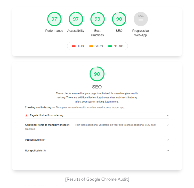
Click “Perform an audit…” (All available audit types should be selected by default). Then click “Run audit”. (It’ll then take a minute or so to run the audit). Once the audit is complete, you should see results that look like this:
As you can see, Gatsby’s performance is excellent out of the box but you’re missing some things for PWA, Accessibility, Best Practices, and SEO that will improve your scores (and in the process make your site much more friendly to visitors and search engines).
Add a manifest file
Looks like you have a pretty lackluster score in the “Progressive Web App” category. Let’s address that.
But first, what exactly are PWAs?
They are regular websites that take advantage of modern browser functionality to augment the web experience with app-like features and benefits. Check out Google’s overview of what defines a PWA experience.
The web app manifest is a simple JSON file that tells the browser about your web application and how it should behave when ‘installed’ on the user’s mobile device or desktop.
Gatsby’s manifest plugin configures Gatsby to create a manifest.webmanifest file on every site build.
✋ Using gatsby-plugin-manifest
Install the plugin:
1 2
npm install gatsby-plugin-manifest
Add a favicon for your app under src/images/icon.png. For the purposes of this tutorial you can use this example icon, should you not have one available. The icon is necessary to build all images for the manifest. For more information, look at the docs for gatsby-plugin-manifest.
Add the plugin to the plugins array in your gatsby-config.js file.
gatsby-config.js
1 2 3 4 5 6 7 8 9 10 11 12 13 14 15 16 17 18 19
Copygatsby-config.js: copy code to clipboard { plugins: [ { resolve: `gatsby-plugin-manifest`, options: { name: `GatsbyJS`, short_name: `GatsbyJS`, start_url: `/`, background_color: `#6b37bf`, theme_color: `#6b37bf`, // Enables "Add to Homescreen" prompt and disables browser UI (including back button) // see https://developers.google.com/web/fundamentals/web-app-manifest/#display display: `standalone`, icon: `src/images/icon.png`, // This path is relative to the root of the site. }, }, ] }
That’s all you need to get started with adding a web manifest to a Gatsby site. The example given reflects a base configuration — Check out the plugin reference for more options.
Add offline support
Another requirement for a website to qualify as a PWA is the use of a service worker. A service worker runs in the background, deciding to serve network or cached content based on connectivity, allowing for a seamless, managed offline experience.
Gatsby’s offline plugin makes a Gatsby site work offline and more resistant to bad network conditions by creating a service worker for your site.
✋ Using gatsby-plugin-offline
Install the plugin:
1 2
npm install gatsby-plugin-offline
Add the plugin to the plugins array in your gatsby-config.js file.
Copygatsby-config.js: copy code to clipboard { plugins: [ { resolve: `gatsby-plugin-manifest`, options: { name: `GatsbyJS`, short_name: `GatsbyJS`, start_url: `/`, background_color: `#6b37bf`, theme_color: `#6b37bf`, // Enables "Add to Homescreen" prompt and disables browser UI (including back button) // see https://developers.google.com/web/fundamentals/web-app-manifest/#display display: `standalone`, icon: `src/images/icon.png`, // This path is relative to the root of the site. }, }, `gatsby-plugin-offline`, ] }
That’s all you need to get started with service workers with Gatsby.
💡 The offline plugin should be listed after the manifest plugin so that the offline plugin can cache the created manifest.webmanifest.
Add page metadata
Adding metadata to pages (such as a title or description) is key in helping search engines like Google understand your content and decide when to surface it in search results.
React Helmet is a package that provides a React component interface for you to manage your document head.
Gatsby’s react helmet plugin provides drop-in support for server rendering data added with React Helmet. Using the plugin, attributes you add to React Helmet will be added to the static HTML pages that Gatsby builds.
✋ Using React Helmet and gatsby-plugin-react-helmet
Make sure you have a description and an author configured inside your siteMetadata object. Also, add the gatsby-plugin-react-helmet plugin to the plugins array in your gatsby-config.js file.
The above code sets up defaults for your most common metadata tags and provides you an <SEO> component to work within the rest of your project. Pretty cool, right?
Now, you can use the <SEO> component in your templates and pages and pass props to it. For example, add it to your blog-post.js template like so:
The above example is based off the Gatsby Starter Blog. By passing props to the <SEO> component, you can dynamically change the metadata for a post. In this case, the blog post title and excerpt (if it exists in the blog post markdown file) will be used instead of the default siteMetadata properties in your gatsby-config.js file.
Now, if you run the Lighthouse audit again as laid out above, you should get close to—if not a perfect— 100 score!
In this section, we’ve shown you a few Gatsby-specific tools to improve your site’s performance and prepare to go live.
Lighthouse is a great tool for site improvements and learning — Continue looking through the detailed feedback it provides and keep making your site better!
Official Plugins: The complete list of all the Official Plugins maintained by Gatsby.
Official Starters
Gatsby’s Default Starter: Kick off your project with this default boilerplate. This barebones starter ships with the main Gatsby configuration files you might need. working example
React-driven single-page applications (SPAs) are gaining momentum. Used by tech giants like Facebook, Twitter, and Google, React allows for building fast, responsive, and animation-rich websites and web applications with a smooth user experience.
However, products created with React (or any other modern JavaScript framework like Angular, Vue, or Svelte) have limited capabilities for search engine optimization. This becomes a problem if a website mostly acquires customers through website content and search marketing.
Luckily, there are a couple of ready-made solutions for React that can help you achieve visibility in search engines. We talk about them below.
But before we dive deep into technical details of optimizing single-page applications (SPA), let’s deal with some useful theory to help you understand the challenges with SEO in React websites.
What’s a single-page app and why React?
A single-page application is a web application whose content is served in a single HTML page. This page is dynamically updated, but it doesn’t fully reload each time a user interacts with it. Instead of sending a new request to the server for each interaction and then receiving a whole new page with new content, the client side of a single-page web app only requests and loads data that needs to be updated.
Facebook, Twitter, Netflix, Trello, Gmail, and Slack are all examples of single-page apps.
From the developer’s perspective, SPAs keep the presentation layer (the front end) and the data layer (the back end) separate, so two teams can develop these parts in parallel. Also, with an SPA, it’s easier to scale and use a microservices architecture than it is with a multi-page app.
From the user’s perspective, single-page apps offer seamless interaction with a web app. Plus, these apps can cache data in local storage, meaning they’ll load even faster the second time.
When it comes to building an SPA, developers can use one of the popular JavaScript frameworks: React, Angular, or Vue. Among these big three, React holds the top spot. React is the most popular JavaScript framework according to the 2019 State of JavaScript Survey.
Thanks to React’s component-based architecture, it’s easy to reuse code and divide a large app into smaller parts. Hence, maintaining and debugging large SPA projects is much easier than doing the same for large multi-page apps. The virtual DOM ensures high app performance. Also, the React library supports all modern browsers, including their older versions.
But as you might have guessed, React has disadvantages as well, and one of the biggest is the lack of SEO-friendliness.
Principles of search engine optimization
Search engine optimization (SEO) is the practice of increasing the quality and quantity of web traffic to a website by increasing its visibility on search engines.
The main task of SEO is to help a web app rank in search engines (Google, Bing) when the target audience searches for information by a certain keyword. Most SEO efforts focus on optimizing apps for Google. After all, as of 2020 Google has a 92.16% search engine market share according to StatCounter.
According to Backlinko, 75% of all user clicks go to the top three websites in search engine results, while websites from the second results page and beyond get only 0.78% of clicks. That’s why digital businesses are furiously fighting to get on this first page of search results.
For business owners, it’s crucial to think of an SEO optimization strategy from the very beginning of web app development to find an effective technology stack.
To determine a website’s ranking in search results, search engines use web crawlers. A web crawler is a bot that regularly visits web pages and analyzes them according to specific criteria set by the search engine. Each search engine has its own crawler, and Google’s crawler is called the Googlebot.
The Googlebot explores pages link by link, gathers information on website freshness, content uniqueness, number of backlinks, etc., downloads HTML and CSS files, and sends all of this data to Google servers. Then it’s analyzed and indexed by a system called Caffeine. This is a fully automatic process, so it’s vital to ensure that crawlers correctly understand the website content. And here’s where the problem appears.
What’s wrong with optimizing single-page applications (SPA) for search engines?
Typically, single-page apps load pages on the client side: at first, the page is an empty container; then JavaScript pushes content to this container. The simplest HTML document for a React app might look as follows:
1
2
3
4
5
6
7
8
9
10
<html lang="en"> <head> <title>React App</title> </head> <body> <noscript>You need to enable JavaScript to run this app.</noscript> <divid="root"></div> <scriptsrc="/static/js/bundle.js"></script> </body> </html>
As you can see, there’s nothing except the
tag and an external script. Single-page applications need a browser to run a script, and only after the script is run will the content be dynamically loaded to the web page. So when a crawler visits the website, it sees an empty page without content. Hence, the page cannot be indexed.
In autumn 2015, Google announced that their bots would also inspect the JavaScript and CSS of web pages, so they would be able to render and understand web pages like browsers do. That was great news, but there are still problems with SEO optimization:
Long delays
If the content on a page updates frequently, crawlers should regularly revisit the page. This can cause problems, since reindexing may only be done a week later after the content is updated, as Google Chrome developer Paul Kinlan reports on Twitter.
This happens because the Google Web Rendering Service (WRS) enters the game. After a bot has downloaded HTML, CSS, and JavaScript files, the WRS runs the JavaScript code, fetches data from APIs, and only after that sends the data to Google’s servers.
Limited crawling budget
The crawl budget is the maximum number of pages on your website that a crawler can process in a certain period of time. Once that time is up, the bot leaves the site no matter how many pages it’s downloaded (whether that’s 26, 3, or 0). If each page takes too long to load because of running scripts, the bot will simply leave your website before indexing it.
Talking about other search engines, Yahoo’s and Bing’s crawlers will still see an empty page instead of dynamically loaded content. So getting your React-based SPA to rank at the top on these search engines is a will-o’-the-wisp.
You should think of how to solve this problem on the stage of designing app architecture.
Solving the problem
There are a couple of ways to make a React app SEO-friendly: by creating an isomorphic React app or by using prerendering.
Isomorphic React apps
In plain English, an isomorphic JavaScript application (or in our case, an isomorphic React application) can run on both the client side and the server side.
Thanks to isomorphic JavaScript, you can run the React app and capture the rendered HTML file that’s normally rendered by the browser. This HTML file can then be served to everyone who requests the site (including Googlebot).
On the client side, the app can use this HTML as a base and continue operating on it in the browser as if it had been rendered by the browser. When needed, additional data is added using JavaScript, as an isomorphic app is still dynamic.
An isomorphic app defines whether the client is able to run scripts or not. When JavaScript is turned off, the code is rendered on the server, so a browser or bot gets all meta tags and content in HTML and CSS.
When JavaScript is on, only the first page is rendered on the server, so the browser gets HTML, CSS, and JavaScript files. Then JavaScript starts running and the rest of the content is loaded dynamically. Thanks to this, the first screen is displayed faster, the app is compatible with older browsers, and user interactions are smoother in contrast to when websites are rendered on the client side.
Building an isomorphic app can be really time-consuming. Luckily, there are frameworks that facilitate this process. The two most popular solutions for SEO are Next.js and Gatsby.
Next.js is a framework that helps you create React apps that are generated on the server side quickly and without hassle. It also allows for automatic code splitting and hot code reloading. Next.js can do full-fledged server-side rendering, meaning HTML is generated for each request right when the request is made.
Gatsby is a free open-source compiler that allows developers to make fast and powerful websites. Gatsby doesn’t offer full-fledged server-side rendering. Instead, it generates a static website beforehand and stores generated HTML files in the cloud or on the hosting service. Let’s take a closer look at their approaches.
Gatsby vs Next.js
The challenge of SEO for GatsbyJS framework is solved by generating static websites. All HTML pages are generated in advance, during the development or build phase, and are then simply loaded to the browser. They contain static data that can be hosted on any hosting service or in the cloud. Such websites are very fast, since they aren’t generated at runtime and don’t wait for data from the database or API.
But data is only fetched during the build phase. So if your web app has any new content, it won’t be shown until another build is run.
This approach works for apps that don’t update data too frequently, i.e. blogs. But if you want to build a web app that loads hundreds of comments and posts (like forums or social networks), it’s better to opt for another technique.
The second approach is server-side rendering (SSR), which is offered by Next.js. In contrast with traditional client-side rendering, in server-side rendering, HTML is generated on the server, and then the server sends already generated HTML and CSS files to the browser. Also, with Next.js, HTML is generated each time a client sends a request to the server. This is vital when a web app contains dynamic data (as forums or social networks do). For SSR to work on React, developers also need to use the Node.js server, which can process all requests at runtime.
Server-side rendering with Next.js
The Next.js rendering algorithm looks as follows:
The Next.js server, running on Node.js, receives a request and matches it with a certain page (a React component) using a URL address.
The page can request data from an API or database, and the server will wait for this data.
The Next.js app generates HTML and CSS based on the received data and existing React components.
The server sends a response with HTML, CSS, and JavaScript.
Making website SEO Friendly with GatsbyJS
The process of optimizing React applications is divided into two phases: generating a static website during the build and processing requests during runtime.
Gatsby’s bundling tool receives data from an API, CMS, and file system.
During deployment or setting up a CI/CD pipeline, the tool generates static HTML and CSS on the basis of data and React components.
After compilation, the tool creates an about folder with an index.html file. The website consists of only static files, which can be hosted on any hosting service or in the cloud.
Request processing during runtime happens like this:
Gatsby instantly sends HTML, CSS, and JavaScript files to the requested page, since they already were rendered during compilation.
After JavaScript is loaded to the browser, the website starts working like a typical React app. You can dynamically request data that isn’t important for SEO and work with the website just like you work with a regular single-page React app.
Creating an isomorphic app is considered the most reliable way to make React SEO-compatible, but it’s not the only option.
Prerendering
The idea of prerendering is to preload all HTML elements on the page and cache all SPA pages on the server with the help of Headless Chrome. One popular way to do this is using a prerendering service like prerender.io. A prerendering service intercepts all requests to your website and, with the help of a user-agent, defines whether a bot or a user is viewing the website.
If the viewer is a bot, it gets the cached HTML version of the page. If it’s a user, the single-page app loads normally.
Prerendering has a lighter server payload compared to server-side rendering. But on the other hand, most prerendering services are paid and work poorly with dynamically changing content.
Using Gatsby: A demo project
To demonstrate how isomorphic React apps work, we’ve created a simple app for the Yalantis blog using Gatsby. We’ve uploaded the source code of the app to this repository on GitHub.
Gatsby renders only the starting page. Then the website works as a single-page app. To see how this isomorphic app works, just turn off JavaScript in your browser’s devtools. If you use Chrome, here are instructions on how to do that. If you refresh the page, the website should work just like it works with JavaScript turned on.
Now let’s check the audit result using Lighthouse. Its performance is close to 100, while SEO for Gatsby.js applications is measured as high as 90.
If this website were on the production server, all indicators would be approximately 100.
The bottom line
Single-page React applications offer exceptional performance, seamless interactions close to those of native applications, a lighter server payload, and ease of web development.
Challenges with SEO shouldn’t be a reason for you to avoid using the React library. Instead, you can use the above-mentioned solutions to fight this issue. Moreover, search engine crawlers are getting smarter every year, so in the future, SEO optimization may no longer be a pitfall of using React.
There was a time when XMLHttpRequest was used to make API requests. It didn’t include promises, and it didn’t make for clean JavaScript code. Using jQuery, you used the cleaner syntax with jQuery.ajax().
Now, JavaScript has its own built-in way to make API requests. This is the Fetch API, a new standard to make server requests with promises, but includes many other features.
In this tutorial, you will create both GET and POST requests using the Fetch API.
Many projects on the web need to interface with a REST API at some stage in their development. Axios is a lightweight HTTP client based on the $http service within Angular.js v1.x and is similar to the native JavaScript Fetch API.
Axios is promise-based, which gives you the ability to take advantage of JavaScript’s async and await for more readable asynchronous code.
You can also intercept and cancel requests, and there’s built-in client-side protection against cross-site request forgery.
In this article, you will see examples of how to use Axios to access the popular JSON Placeholder API within a React application.
nlp-roadmap is Natural Language ProcessingROADMAP(Mind Map) and KEYWORD for students those who have interest in learning Natural Language Processing. The roadmap covers the materials from basic probability/statistics to SOTA NLP models.
There are moments while working when you realize that you may need a large amount of data in a short amount of time. These could be instances when your boss or customer wants a specific set of information from a specific website. Maybe they want you to collect over a thousand pieces of information or data from said website. So what do you do?
One option could be to check out this website and manually type in every single piece of information requested. Or better yet, you could make Python do all the heavy lifting for you!
Utilizing one of Python’s most useful libraries, BeautifulSoup, we can collect most data displayed on any website by writing some relatively simple code. This action is called Web Scraping. In the next few parts, we will be learning and explaining the basics of BeautifulSoup and how it can be used to collect data from almost any website.
The Challenge
In order to learn how to use BeautifulSoup, we must first have a reason to use it. Let’s say that hypothetically, you have a customer that is looking for quotes from famous people. They want to have a new quote every week for the next year. They’ve tasked us with the job to present them with at least fifty-two quotes and their respective authors.
Website to Scrape
We can probably just go to any website to find these quotes but we will be using this website for the list of quotes. Now our customer wants these quotes formatted into a simple spreadsheet. So now we have the choice of either typing out fifty-two quotes and their respective authors in a spreadsheet or we can use Python and BeautifulSoup to do all of that for us. So for the sake of time and simplicity, we would rather go with Python and BeautifulSoup.
Starting BeautifulSoup
Let’s begin with opening up any IDE that you prefer but we will be using Jupyter Notebook. (The Github code for all of this will be available at the end of the article).
Importing Python Libraries
We will start by importing the libraries needed for BeautifulSoup:
from bs4 import BeautifulSoup as bs import pandas as pd pd.set_option(‘display.max_colwidth’, 500) import time import requests import random
Accessing the Website
Next, we’ll have to actually access the website for BeautifulSoup to parse by running the following code:
This returns a response status code letting us know if the request has been successfully completed. Here we are looking for Response [200] meaning that we have successfully reached the website.
Parsing the Website
Here we will be parsing the website using BeautifulSoup.
soup = bs(page.content)soup
Running this code will return what looks like a printed text document in HTML code that looks like this:
We can navigate through the above, parsed document using BeautifulSoup.
Navigating the Soup
Now we will need to find the exact thing we are looking for in the parsed HTML document. Let’s start by finding the quotes.
An easy way to find what we are looking for is by:
Going to the webpage and finding the desired piece of information (in our case, the quotes).
Highlight that piece of information (the quote)
Right click it and select Inspect
This will bring up a new window that look like this:
The highlighted section is where we will find the quote we are looking for. Just click the arrow on the left of the highlighted section to see the quote in the code.
HTML Information for Navigation
Based on the HTML code we see highlighted we can use that information to navigate the soup. We will be using the .find_all() attribute in our own code to potentially find the quotes we are looking for. This attribute will be able to return to us the desired line (or lines) of code based on whatever arguments we give it. Since we can see that the HTML code for the quote contains class=“text”, we can use that in our BeautifulSoup code:
soup.find_all(class_=’text’)
Running this code will return the following results:
From this we can see that we are able to successfully locate and retrieve the code and text containing the quotes needed.
In order to only retrieve the text and exclude the unnecessary code, we will have to use the .text attribute in each result. To do so, we will have iterate through the list using a “for” loop:
quotes = [i.text for i in soup.find_all(class_=’text’)]quotes
This will give us the list of quotes without their respective HTML code:
Now we know how we can access the quotes within the website and retrieve them for our purposes. Repeat the steps mentioned before to retrieve the author names for each quote as well:
authors = [i.text for i in soup.find_all(class_=’author’)]
Accessing Multiple Pages
Now that we know how to retrieve data from a specific webpage, we can move on to the data from the next set of pages. As we can see from the website, all the quotes are not stored on a single page. We must be able to navigate to different pages in the website in order to get more quotes.
Notice that the url for each new page contains a changing value:
From this list, we can create another “for” loop to collect the necessary number of quotes and their respective authors.
Avoiding Web Scraping Detection
One important thing to note: some websites do not approve of web scraping. These sites will implement ways to detect if you are using a web scraping tool such as Beautiful Soup. For example, a website can detect if a large number requests were made in a short amount of time, which is what we are doing here. In order to potentially avoid detection, we can randomize our request rate to closely mimic human interaction. Here is how we do that:
Generate a list of values:
rate = [i/10 for i in range(10)]
Then at the end of every loop, input the following piece of code:
time.sleep(random.choice(rate))
Here we are randomly choosing a value from the list we created and waiting that selected amount of time before the loop begins again. This will slow down our code but will help us avoid detection.
Bringing it all Together
Now that we have all the pieces, we can construct the final “for” loop that will gather at least 52 quotes and their respective authors:
The Entire Code to Retrieve at least 52 Quotes and their Authors
Once we run the code above we will end up with a list of quotes and a list of authors. However, our customer wants the quotes in a spreadsheet. To accommodate that request, we will have to use the Python library: Pandas.
Inputting the lists into a Pandas DataFrame is very simple:
# Creating a DataFrame to store our newly scraped information df = pd.DataFrame()# Storing the quotes and authors in their respective columns df[‘Authors’] = authorsdf[‘Quotes’] = quotes
Since the quotes and the authors were scraped in order, they will be easy to input into the DataFrame.
Once we have finished and ran the code above, the final DF will look like so:
Excellent! The DF looks great and is in the exact format requested from the customer. We can then save the DF as an excel spreadsheet file which we can then send to our customer.
Closing
We hope you learned a little bit about web scraping from this step-by-step tutorial. Even though the example we used may be quite simple, the techniques used will still be applicable to many different websites all over the internet. More complex looking websites that require extensive user interaction will require another Python library called Selenium. However, most websites will only need BeautifulSoup to scrape data. The walkthrough we have done here should be enough to get you started. Happy scraping!
While the component-driven approach has ushered in a new frontier in the way we build web applications, it isn’t without its imperfections — one being its usability and scalability with CSS. This has given birth to a new way to construct and manage our styles in a component-specific manner, otherwise knows as CSS-in-JS.