CSS垂直居中是工作中经常遇到的问题,也是前端面试常问问题。
总体来说,CSS块元素垂直居中分为两种情况:子元素宽高固定或不固定。
子元素宽高固定比较简单,结合padding或margin设置居中即可。子元素宽高不固定也有办法,总结起来大概有设置绝对定位、设置显示方式为flex或table-cell。
垂直居中DEMO
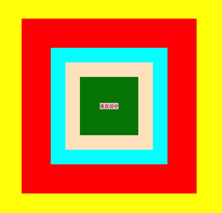
上图用到了5种方法居中:
- 方法一:父元素设置{display:flex;align-content:center;align-items:center;}
- 方法二:父元素和子元素设置相同宽高+父元素设置padding
- 方法三:父元素相对定位,子元素绝对定位,left、right、top、bottom为0;margin为auto;
绝对定位盒子模型有个特点:left+right+width+padding+margin=包含块的宽度;
所以此时可以将left、right(默认值为auto,所以需要重设置)设置为0,而padding已经确定(未设置时默认值为0px),
所以剩下的都是margin,但是margin的默认值是0px。所以就将magin设为auto,使得元素自动居中了;
- 方法四:父相对子绝对,上下为50%,使用margin或translate将偏离父元素中心的那段拽回来
(1)子元素宽高固定,父相对子绝对,上下为50%,使用margin-left和margin-top设为子元素的一半的负数。就是将偏离父元素中心的那段拽回来;
绝对定位脱离文档流,不会对后续元素的布局造成影响。但如果绝对定位元素是唯一的元素则父元素也会失去高度。
(2)父元素相对定位,子元素绝对定位;
将子元素left和top直接设为50%,相对的是父元素;
子元素宽高不固定,使用transform:translate(-50%,-50%)将偏离父元素中心的那段拽回来;
- 方法五 table-cell+inline-block
现把上图代码贴出来:
CSS
1
2
3
4
5
6
7
8
9
10
11
12
13
14
15
16
17
18
19
20
21
22
23
24
25
26
27
28
29
30
31
32
33
34
35
36
37
38
39
40
41
42
43
44
45
46
47
48
49
50
51
52
53
54
55
56
57
58
59
60
61
62
63
64
65
66
67
68
69
70
71
72
73
74
75
76
77
78
79
80
81
82
83
84
85
86
87
88
89
90
91
| *{
margin:0;
padding:0;
}
.yellow{
margin-top:50px;
width:100%;
height:800px;
display: flex;
align-content: center;
align-items: center;
background-color: yellow;
}
.red{
margin: 0 auto;
width: 400px;
height:400px;
padding:100px;
box-sizing: content-box;
background-color: red;
}
.aqua{
width:400px;
height:400px;
background-color: aqua;
position: relative;
}
.bisque{
height:300px;
width:300px;
position: absolute;
left:0;
right:0;
top:0;
bottom:0;
margin: auto;
background-color:bisque;
}
.relative-parent{
width:100%;
height:100%;
position: relative;
}
.green{
background-color: green;
height:200px;
width:200px;
position: absolute;
left:50%;
top:50%;
margin-left:-100px;
margin-top: -100px;
}
.darkorchid{
background-color: darkorchid;
position: absolute;
margin-top:50%;
margin-left:50%;
transform: translate(-50%,-50%);
}
.tablecell-parent{
display: table-cell;
text-align: center;
vertical-align: middle;
}
.pink{
background-color: pink;
display: inline-block;
}
|
HTML
1
2
3
4
5
6
7
8
9
10
11
12
13
14
15
16
17
18
19
20
21
22
23
24
25
26
27
| <!DOCTYPE html>
<html>
<head>
<title>CSS垂直居中</title>
</head>
<body>
<div class="yellow">
<div class="red">
<div class="aqua">
<div class="bisque">
<div class="relative-parent">
<div class="green">
<div class="relative-parent">
<div class="darkorchid">
<div class="tablecell-parent">
<div class="pink">垂直居中</div>
</div>
</div>
</div>
</div>
</div>
</div>
</div>
</div>
</div>
</body>
</html>
|